At the workshop, I’m often asked a question: “Christelle, don’t you feel limited by always using the same mug shape and this same blue?”. My answer is always the same: it’s precisely this limit that frees my creativity. Far from being a barrier, constraint is a motor that forces me to explore every corner of an idea to extract its essence.
From Technical Experience to the Obvious Choice of Blue
However, my path wasn’t monochrome right from the start. In my early days, I explored a multitude of directions. In pottery, the possibilities are literally infinite: you can test hundreds of glazes, layer colors, play with chemical textures or crystallization effects… It’s a fascinating playground, but one where it’s also easy to get scattered.
My quest began with technical research into ceramic pencils. Very quickly, I was faced with the harsh laws of fire chemistry. I fire my stoneware pieces at high temperatures, at 1250°C, and at this level of heat, very few pigments survive. I had a choice between three colors capable of resisting such a firing: black, blue, and green.
I tried everything. Black, while graphic, didn’t touch me; I found it too harsh for the world of softness I wanted to create. Green, for its part, was a technical disappointment: because of the chemistry of the clear glaze I use to protect my pieces, it didn’t come out green but systematically turned black. As for bright colors like pink, orange, or red, they literally evaporate at 1250°C; they are reserved for low temperatures, like for firing earthenware.
It was when I tested the blue pencil from Hobbyceram that everything became clear. On my raw beige clay, this blue remained vibrant and true. The match was immediate. This deep blue balanced perfectly with the mineral warmth of the stoneware. That’s where my exploration of blue artisanal ceramics truly began: as an obvious choice imposed by the material itself.
Constraint as a Graphic Playground
Once this technical framework was set — one clay, one tool, one color — I opened a door to endless graphic exploration. Working under constraints forces me to reinvent the pattern infinitely so that each piece remains unique. This is how my different designs were born:
- Patterns like the sketched checkered mug for an architectural and vibrant feel.
- Brush-painted stripes for a freer, more fluid, and almost marine gesture.
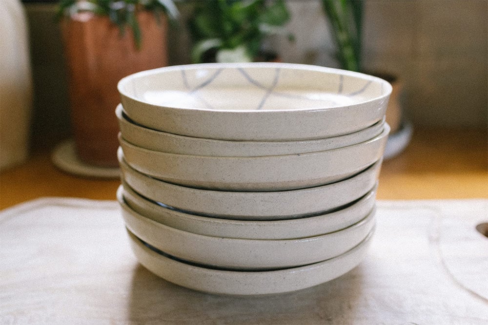
- Small minimalist drawings like on the CHILL plates for a touch of modernity and a smile first thing in the morning.
This unity of color allows for the creation of a true family of objects. No matter which pattern you choose, your Grandchose pieces will always match perfectly on your table or shelves. That’s the strength of a coherent collection: you can mix the designs while maintaining a soothing visual harmony.
This approach to creation aligns with that of an artist I admire greatly: Hervé Tullet. In his inspiration book “J’aime bien” (I Like It), he explores exactly this idea that creativity is often born from very simple rules of the game. Like him, I believe that by limiting your tools — for me, the same clay, the blue pencil, and one mug shape, for example — you paradoxically unlock immense freedom. Tullet plays with dots and lines; I play with patterns and simple little drawings. It’s by saying “I like this line” or “I like this contrast” that you end up creating a collection that has meaning and heart. It’s an infinite search.

Why Blue? A Symbolism of Serenity
Beyond the tool, the choice of blue artisanal ceramics meets a need for calm. Blue is a universal color, often associated with the horizon, water, and serenity. In Provence, blue is everywhere, from the sky of Pernes-les-Fontaines to the reflections of the Sorgue. By applying it to my mugs and bowls, I feel I’m offering objects that soothe daily life.
The sketched blue has this peculiarity of never being totally uniform. Depending on the pressure of my hand, the line becomes denser or lighter, revealing the grain of the clay underneath. It’s this vibration that gives life to the object. You never tire of looking at a blue and beige piece, because it changes with the daylight, offering a depth that overly saturated colors don’t always have, not to mention it makes you want a seaside vacation…
The Gesture at the Heart of Creation
Working this way allows me to deepen my gesture. By perfectly mastering the shape of the mug, I can devote all my attention to the precision of the line. Whether I use my favorite pencil or a brush, each design tells a different emotion, while remaining true to the spirit of French craftsmanship.
Blue artisanal ceramics as I conceive them are a search for intentional simplicity. It’s about proving that with very few ingredients — a well-chosen clay, an ergonomic shape, and an iconic color — you can create an infinity of stories. It’s this daily challenge, between rigor and freedom, that makes my work in the workshop so exciting and which, I hope, brings a bit of this poetry into your home.